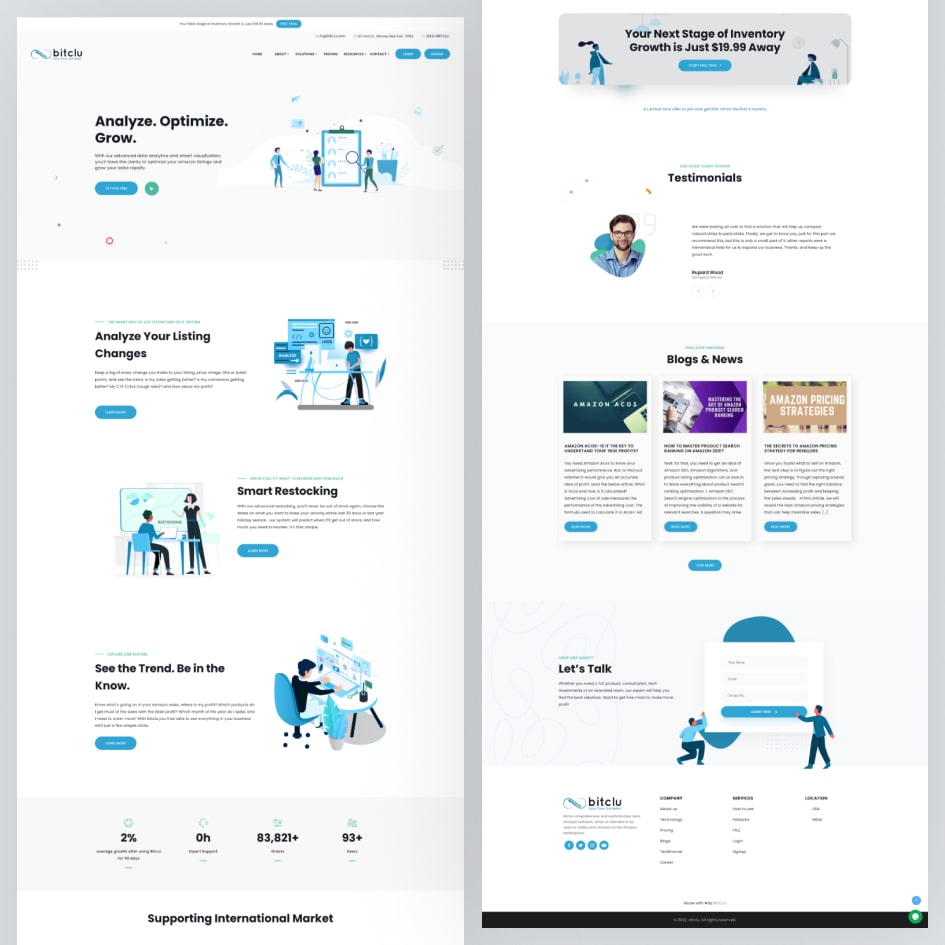
✅ Bitclu.com – Data-Driven Intelligence for Amazon Sellers
Project Type: SaaS Web Application
My Role: Lead UI/UX Designer & Frontend Integrator
Tools Used: Adobe Photoshop CC, InVision, HTML, CSS, Bootstrap, AngularJS
Platforms: Desktop Web (Mobile Responsive)
Timeline: 6+ Months (Active + Maintenance Phase)
🔍 Project Overview
Bitclu.com is a performance analytics dashboard tailored for Amazon sellers to track, analyze, and optimize their business across key eCommerce metrics. With a focus on real-time insights, seller profitability, and inventory alerts, it provides data transparency in a user-friendly interface.
“This was a design-led product, but engineering-driven execution—so I had to bridge the gap between creativity and implementation.”
🧩 Project Background & Challenges
🔧 Tech Stack Challenge
While I had strong visual design expertise, this was one of my early professional encounters with AngularJS. The real challenge began post-design: converting Photoshop mockups into Angular-compatible, production-ready components. It demanded a fast learning curve and adaptability.
| Challenge Area | Details |
|---|---|
| Learning AngularJS | Started from scratch and picked up through hands-on implementation |
| Integration Bottlenecks | Aligning UI designs with Angular component structure |
| Small Team | 1 Designer (myself), 3 Developers, 1 QA, 2 Stakeholders |
| Continuous Support | Stayed through dev, QA, and maintenance cycles |
👥 Collaboration & Workflow
I collaborated directly with 2 key stakeholders (Michael Aushana and another business partner) to derive the app requirements. While the feature set was mostly client-driven, I contributed improvements in user flows, design hierarchy, and data representation.
👨💻 Workflow Approach
| Phase | Description |
|---|---|
| Requirement Gathering | Multiple discussions with stakeholders, competitor analysis of Helium10, SellerBoard, etc. |
| Wireframing & User Flow | Created structured layout in low-fidelity wireframes |
| High-Fidelity UI Design | Designed all interfaces in Adobe Photoshop CC |
| Prototyping | Linked all flows using InVision for demo-ready presentations |
| Frontend Handoff & Dev | Converted my designs into responsive HTML/CSS and Bootstrap, later embedded into AngularJS |
| Testing & QA | Coordinated with QA for visual testing, responsiveness and UX bugs |
| Post-Launch Support | Addressed UI fixes, helped with documentation and onboarding materials |
🔎 Key Features Designed
| Module | Description |
|---|---|
| 📊 Dashboard Overview | Real-time sales, profits, ad spend, product ranking |
| 📦 Product Insights | Each product’s cost, sales trend, and net margin at a glance |
| 🧮 ROI & Profitability | Advanced view to filter ad performance and operational cost metrics |
| 📈 Sales Trends Chart | Weekly/monthly sales comparison visualized for decision-making |
| ⚠️ Inventory Alerts | Low-stock warnings and fulfillment lag notifications |
| 📤 Export & Report Builder | Customizable CSV/PDF reports for performance and inventory audits |
📈 UX Highlights
- Clean, non-cluttered layouts for metric-heavy dashboards
- Designed with Amazon sellers’ daily habits in mind — emphasis on profitability metrics first
- Mobile-friendly design structure for use on tablets and smartphones
- Intuitive navigation with scalable modules for future features
🧠 Design Thinking Approach
Although it was client-driven, I embedded a User-Centered Design (UCD) approach:
- User Interviews: Conducted informal calls with 3 early Amazon sellers (sourced via online seller communities)
- Empathy Mapping: Identified frustrations like “Too much data, hard to interpret” and “Need to act on info quickly”
- Simplified Complexity: Focused on digesting large data into visual chunks—cards, graphs, toggle views
💡 My Contributions (Beyond UI/UX)
- Advocated for export report customization, which became a highly used feature
- Introduced color-coded performance indicators (e.g., red for loss-making SKUs)
- Authored developer handoff documentation and component guidelines
- Supported AngularJS dev team in integrating styles and fixing CSS rendering bugs
📉 Outcome
Even without public-facing performance metrics, qualitative feedback from stakeholders highlighted:
| Feedback Area | Result |
|---|---|
| Design Clarity | Stakeholders appreciated the clean layout and simplicity despite dense data |
| Dev Integration | Codebase had minimal front-end refactor due to component compatibility |
| Client Experience | Beta testers praised the visibility of ROI metrics and inventory alerts |
| Continuous Support | Maintained design quality throughout development and minor iterations post-launch |
📘 Summary Quote
“Bitclu was more than just a dashboard. It was my testing ground to merge creative UI design with the technical depths of AngularJS. Through adaptability, ownership, and user advocacy, I helped transform data into insight, and complexity into clarity.”