🖥️ Case Study: Designing the Complete Digital Ecosystem for Equus Compute Solutions
“From siloed systems to a cohesive digital experience for hyperscale enterprise clients — designed from the ground up.”
🔍 Background
Equus Compute Solutions is a U.S.-based leader in custom computing infrastructure, building powerful server and workstation solutions for high-performance needs. Their client base includes hyperscalers like Google, Netflix, and major enterprises, each requiring tailored hardware and high-volume ordering processes.
When I was brought on board, Equus had several disjointed digital touchpoints — from internal dashboards to customer-facing websites. My mission was to strategize, design, and unify their entire digital ecosystem across all brands and platforms.
🧠 My Role
I worked as the sole designer leading the complete digital design overhaul for Equus and its sub-brands. From research to launch and maintenance, I took ownership of:
- 🧩 UI/UX design across 7+ digital platforms
- 🔍 User research, journey mapping, usability testing
- 🧠 Product strategy, including RICE analysis and service blueprinting
- 🖼️ Creation of design systems, PDF documents, and visual assets
- 🤝 Collaboration with developers, engineers, and product owners for execution and handoffs
- 🔁 Ongoing support post-launch for optimization and stakeholder requests
🌐 Platforms I Designed
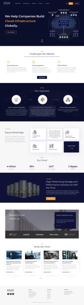
- equuscs.com – Main corporate site
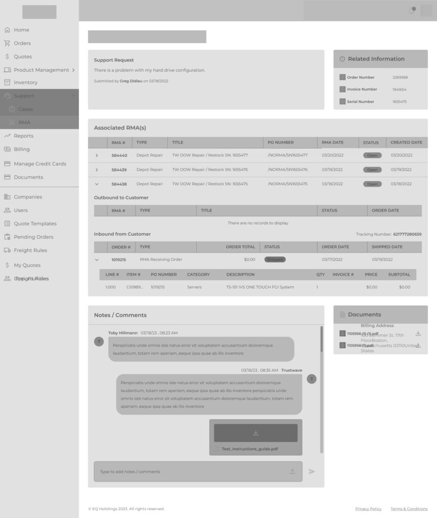
- hub.equuscs.com – Internal order management system for high-volume hardware orders
- serversdirect.com – Enterprise storefront for computing products
- serversdirect.com/hub – Integrates storefront with internal ops
- channel.equuscs.com – Partner/distributor portal
- eqh.com – Microsite
- https://www.rimage.com/ – Optical Disc Publishing & Secure Media Solutions Platform
- intequus.com – Platform launching soon
🎯 The Challenge
Each platform had grown independently with its own UI, UX, and structural logic — leading to:
- Inconsistent brand experience
- Fragmented workflows across user roles (engineers, resellers, ops)
- Inefficient internal tools (especially HUB)
- Disconnected marketing assets and documentation
- No shared design language or system across properties
This created friction for both internal users and external clients — reducing efficiency and trust.
🔬 Discovery & Research
I began with a deep discovery phase to align design efforts with both user needs and business objectives.
👥 User & Stakeholder Interviews
I conducted interviews with:
- Sales and operations teams
- Engineering and QA teams
- Product owners and customer success leads
- Key clients (via anonymized feedback through the sales team)
This helped me understand pain points like:
- Delays in internal order approvals
- Unclear documentation and spec visuals
- Clunky multi-step checkout/order forms
📊 Quantitative Research
Using tools like Google Analytics, Hotjar, and internal ticket logs, I discovered:
- 18%–20% bounce rate on product pages
- ~30% drop-off in mid-funnel on HUB (multi-step approval flow)
- Recurring internal support tickets related to UI confusion or miscommunication

🔄 Strategy & Planning
📌 RICE Prioritization
To tackle challenges efficiently, I applied RICE scoring to prioritize redesign tasks for HUB and storefronts based on:
- Reach – How many users it affects
- Impact – How much improvement it brings
- Confidence – Backed by qualitative + quantitative evidence
- Effort – Time/resources needed to build
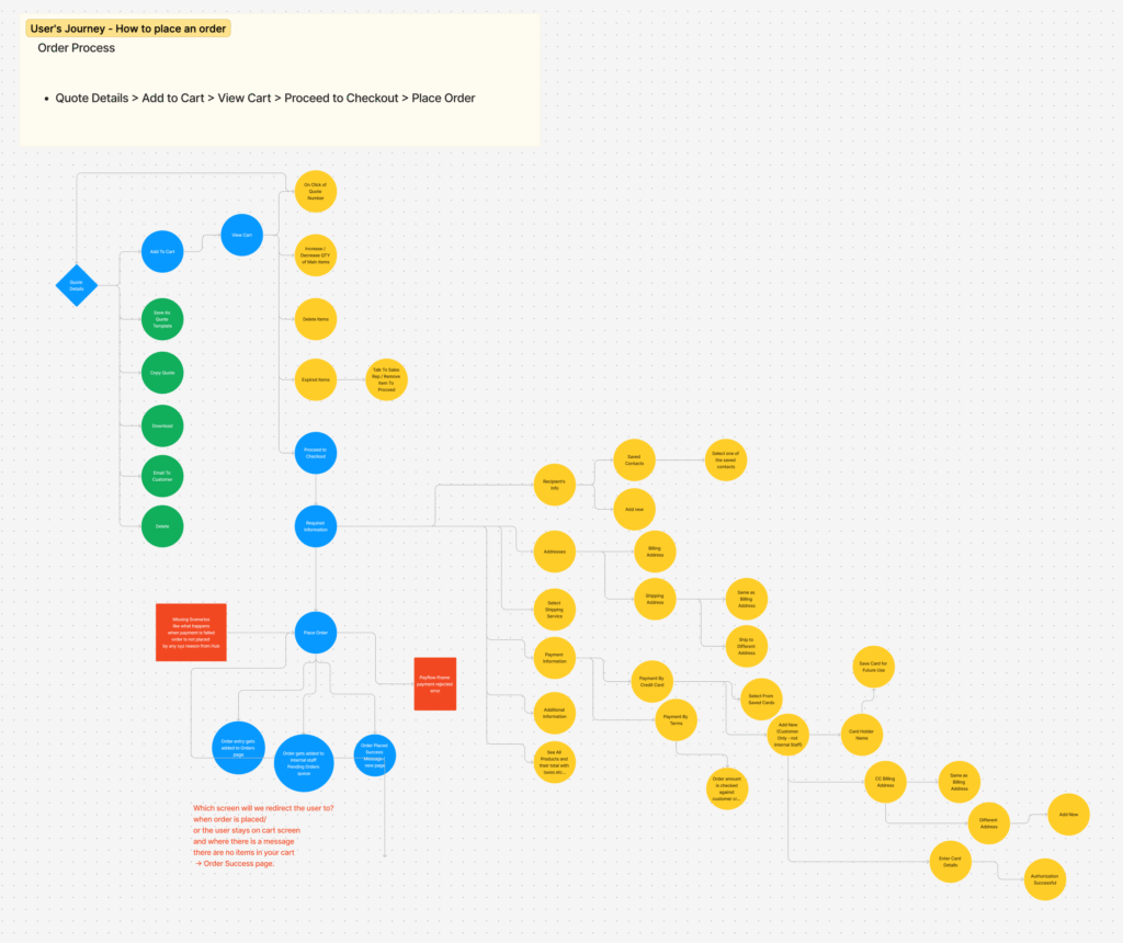
🔄 Service Blueprinting
I visualized data flow, dependencies, and user interactions across platforms using service blueprints to ensure technical feasibility and UX clarity.
🧭 Journey Mapping
I mapped different personas and workflows:
- Enterprise clients ordering in bulk
- Internal order teams validating specs
- Partners accessing collateral on channel.equuscs.com
- B2B customers browsing serversdirect.com
These maps helped expose:
- UI dead-ends
- Excessive cognitive load on internal forms
- Redundant approval steps that could be auto-resolved
✍️ Design Execution
With insights in place, I moved into ideation and design:
- Built low- to high-fidelity wireframes for each platform
- Created a unified component library in Figma for faster dev handoff
- Made all platforms WCAG-compliant, fully responsive
- Designed 20+ PDFs, spec sheets, diagrams, and supporting graphics
- Wrote design documentation and onboarding notes for internal teams
[Wireframe of HUB]
[Homepage UI EquusCS.com]
🤝 Collaboration
As a solo designer on this large initiative, I worked closely with:
- 🧑💻 Frontend and backend developers to ensure seamless implementation
- 🧑💼 Product owners and stakeholders to align on timelines and vision
- 📩 Marketing teams for brand tone, PDF needs, and messaging consistency
- 🧪 QA and support teams to catch edge cases and refine final interactions
I maintained regular standups, feedback loops, and used Zeplin, Notion, and Loom walkthroughs to streamline the handoff process.
📦 Deliverables
- ✅ Fully redesigned 8 digital platforms
- ✅ Custom UI Kit + reusable component system
- ✅ Over 20 PDF brochures/spec documents
- ✅ Research documents (interview notes, journey maps, RICE tables)
- ✅ Interactive prototypes in Figma
- ✅ Documentation for development teams
- ✅ Post-launch support for iterations and edge cases
📈 Results & Measurable Impact
📊 How I Tracked It
- Google Analytics: for site usage, bounce rate, engagement
- Hotjar: for click maps, scroll behavior, and friction points
- Surveys & Forms: for qualitative user sentiment
- Internal Support Logs: pre- vs post-launch issue volume
- Manual Task Completion Tests: conducted with internal ops teams before/after HUB redesign
🚀 Highlights
- 40% improvement in task completion time in HUB workflows
- 18% drop in bounce rate on serversdirect.com product pages
- 30% increase in product page engagement (click-throughs, comparisons)
- ~25% fewer internal support tickets post redesign
- Stakeholders reported “significant improvement in client confidence and brand presence”
🧠 Reflection & Takeaways
This project challenged me to think beyond “screen design” and into ecosystem thinking. I had to build not just interfaces, but the connective tissue between people, products, and platforms.
Key Lessons:
- Tooling alone doesn’t create alignment — documentation and communication do
- Internal tools should be treated with the same care as public-facing ones
- Early research pays off throughout — especially when you’re the only designer
🛠 Tools I Used
- Figma – Wireframes, high-fidelity UIs, prototypes
- Miro – Journey mapping, RICE, stakeholder synthesis
- Google Analytics – Performance metrics
- Hotjar – Heatmaps and behavior tracking
- Notion – Research + dev handoff docs
- Zeplin – Developer collaboration
- Illustrator & Photoshop – PDFs, diagrams, spec sheets
- Loom – Walkthroughs and internal training