🌿 Sunday Lawn Care – Personalized Lawn Care, Reimagined
Project: getsunday.com
Role: UI/UX Designer (Marketing Platform Design)
Tools: Adobe XD, Illustrator, Photoshop, Balsamiq, InVision
Approach: User-Centered Design, Agile Collaboration
🚀 Project Overview
Sunday Lawn Care is a revolutionary DTC brand that delivers personalized, environmentally responsible lawn care plans based on scientific data and user-specific insights. With a booming presence in the U.S. and a mission rooted in sustainability, their digital platform needed to convey trust, precision, and lifestyle appeal—all while educating customers and converting visits into subscriptions.
My Role:
I was responsible for designing the marketing face of getsunday.com. This included everything from homepage layout, landing pages, promotional sections, and visual storytelling to supporting social media graphics and email campaign designs. My goal was to translate the brand’s scientific integrity and eco-conscious ethos into a high-performing, visually engaging digital experience.
🎯 Objectives
- Redesign the marketing pages to better communicate the product’s value proposition
- Improve user engagement through thoughtful UX
- Support growth and conversion goals through better structure and clarity
- Create reusable and consistent design systems aligned with brand language
🔍 Discovery & Research
1. Stakeholder Interviews
I collaborated with internal stakeholders—marketing heads, business owners, and brand strategists—to understand their short- and long-term goals. Each discussion revealed unique insights into the product positioning and audience needs.
2. Competitive Analysis
I reviewed competitors like TruGreen, LawnLove, and GreenPal to understand market gaps and UI/UX patterns. Many lacked personalization, sustainability-focused visuals, or educational content.
3. Design Audit
I conducted a full audit of their existing site and content structure:
- Inconsistent visual hierarchy
- Poor above-the-fold engagement
- No clear narrative flow
- Fragmented call-to-action (CTA) patterns
📊 Strategy & Planning
👥 User Persona Development
As part of the user research phase for GetSunday’s website redesign and marketing content strategy, I conducted qualitative interviews to understand the audience deeply—what they need, what they fear, and what motivates their purchase decisions.
🧪 Research Methodology
- Approach: Semi-structured interviews (30–40 mins) via Zoom and Google Meet.
- Recruitment Platforms: I reached out to potential interviewees using:
- Facebook gardening communities (e.g., “Backyard Gardeners USA”)
- Reddit (r/lawncare, r/DIY, r/HomeImprovement)
- GetSunday’s email newsletter base (we obtained permissions for a small test outreach)
- Tools Used:
- Screener forms via Google Forms
- Calendly for scheduling
- Notion and Otter.ai for note-taking and transcription
🧾 Interview Summary
| Interviewer | Participant Name | Source Platform | Participant Type | Agreement Method |
|---|---|---|---|---|
| Vijay Kumar (me) | Jennifer Marks | Facebook Group – Homeowners | Eco-conscious Parent | Agreed after a friendly DM & Calendly invite |
| Vijay Kumar (me) | Kyle Johnson | Reddit – r/lawncare | First-Time Homeowner | Responded to screener form, joined via Zoom |
| Vijay Kumar (me) | Brian Cole | Sunday Newsletter Outreach | Lawn Care Enthusiast | Replied to email request, gave consent via form |
🎯 Personas Developed from Insights
🧑🌾 1. Jennifer Marks – The Eco-Conscious Parent
| Demographics | Married, 37, 2 kids, lives in Portland, OR |
|---|---|
| Goals | A lush lawn that’s safe for her kids and pets |
| Pain Points | Confused by labels, distrusts “organic” claims |
| Tech Comfort | Moderate, shops online, active on Instagram |
| Insights | Responds well to visuals and stories about family safety |
| Design Solution | Focused on clear pet-safe messaging, visual trust markers like icons & badges, and added testimonials from parents. |
🏡 2. Kyle Johnson – The First-Time Homeowner
| Demographics | 28, recently bought a house in Texas, works in tech |
|---|---|
| Goals | Wants a clean, green lawn without becoming an expert |
| Pain Points | Feels overwhelmed by lawn care jargon |
| Tech Comfort | High – uses apps for everything, reads reviews |
| Insights | Loved the idea of a personalized quiz to build confidence |
| Design Solution | Designed an onboarding quiz funnel + mobile-friendly UI with progressive disclosure of content. |
🌱 3. Brian Cole – The Lawn Care Enthusiast
| Demographics | 52, lives in Ohio, works in local government, mows lawn twice a week |
|---|---|
| Goals | Wants to optimize his yard’s performance, improve soil health |
| Pain Points | Distrusts vague product info, needs transparency |
| Tech Comfort | Moderate – prefers desktop, reads PDF guides |
| Insights | Needed detailed comparisons, transparent results and soil testing info |
| Design Solution | Added detailed product comparisons, real customer data and “how it works” breakdown. Also created downloadable PDFs. |
UX Goals:
- Clear, benefits-focused storytelling
- Simplified navigation and plan selection
- Trust-building visuals and content
🧠 Wireframes & UX Flow
Before jumping into high fidelity, I mapped user flows and wireframes in Balsamiq. These were low-fidelity but helped stakeholders quickly visualize direction.
Key Flows Designed:
- Homepage Scroll Flow (Problem > Solution > Proof > CTA)
- Product Education Sections
- Plan Personalization Flow
- Trust Markers & Environmental Proof Points
🎨 Visual Design & UI System
I translated wireframes into high-fidelity UI using Adobe XD, ensuring scalability and alignment with brand guidelines.
Visual Direction:
- Natural tones (greens, browns) for eco-feel
- Clean whitespace to reflect clarity
- Friendly iconography for digestibility
- Lifestyle photography to humanize lawn care
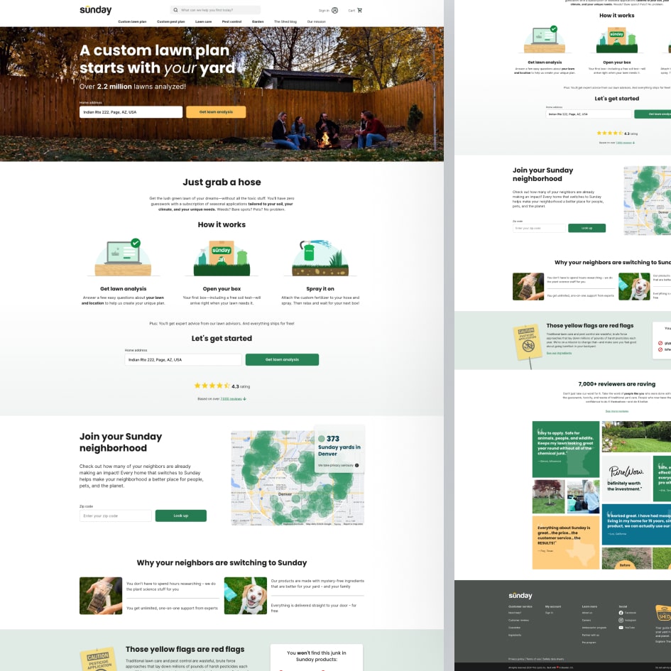
[ Hero Section Mockups]
Reusability:
I created a modular system of components for CTAs, testimonials, product benefits, and FAQs to ensure consistency across all marketing assets.
🧪 A/B Testing & Iteration
Working with the analytics team and product marketing lead, we ran A/B tests for:
- Hero CTAs (e.g., “Start My Plan” vs. “Get a Free Soil Test”)
- Section ordering
- Button placements
Tools Used:
- InVision for prototyping
- Google Optimize for testing variations
🤝 Collaboration & Workflow
- Agile Sprints: Weekly design check-ins with development and content teams
- Versioning: Used XD’s design system components for shared access
- Handoff: Delivered dev-ready screens, responsive specs, and design tokens
✅ Results & Impact
Although I wasn’t in charge of tracking exact KPIs, here’s what stakeholders shared post-launch:
- 📈 Higher engagement and lower bounce rates on newly designed pages
- 🧭 Smoother user navigation leading to faster plan selections
- 🛒 Increased add-to-cart rate due to clearer product education
- 💬 Positive customer feedback about “easy-to-understand” layout
These insights were tracked using:
- Google Analytics (for bounce rate & time-on-page)
- Hotjar (for heatmaps and scroll depth)
- Stakeholder-provided performance snapshots
🧩 Challenges I Tackled
- Explaining complex science-backed personalization to a general audience
- Adapting messaging for users across skill levels—from lawn newbies to enthusiasts
- Designing with eco-consciousness at the core while keeping conversion in mind
💡 What I Learned
This project was a masterclass in balancing marketing conversion with ethical design. I also refined my cross-functional collaboration skills and strengthened my command over systematic, scalable UI components that support evolving content strategies.
🏁 Conclusion
Designing for Sunday Lawn Care allowed me to craft an interface that doesn’t just sell a product—it builds trust, delivers value, and promotes eco-awareness. My contribution helped turn scientific insights into a user-friendly experience people actually enjoy using.